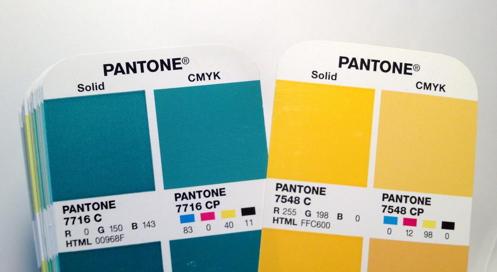
Pantone vs CMYK is the central question for businesses, designers, and packaging specialists seeking flawless color reproduction and brand consistency. As we enter 2025, advancements in printing technologies, environmental considerations, and evolving branding needs raise critical questions about which color system suits your project best.
Understanding Color Systems: Pantone and CMYK
What Is CMYK Printing?
CMYK (cyan, magenta, yellow, and key/black) is a four-color process commonly used for full‑color printing. It mixes these four inks in varying proportions to produce a wide range of tones and hues. CMYK is cost-effective and practical for photographic and complex imagery.printing Pantone vs CMYK It is widely supported by printers globally, making it ideal for packaging designs, brochures, posters, and labels where photo realism and flexible color gradients are essential.
What Is Pantone (Spot Color) Printing?
The Pantone Matching System (PMS) is a proprietary spot color system that uses premixed inks to achieve exact, standardized colors. Each Pantone color is reproducible across print jobs and materials, ensuring consistent branding. Unlike CMYK, Pantone is ideal for precise color matching, flat solids, and distinctive brand hues like metallics or fluorescents.
How Pantone vs CMYK Affects Brand Packaging
In business packaging, color consistency is crucial. When your logo or brand identity relies on a specific shade—say brand red or teal—Pantone ensures the same tone across all print runs. CMYK can approximate these hues, but results vary by printer, substrate, and ink calibration. Some differences may be subtle, but for luxury or premium brands, they are unacceptable.
For packaging with full-color photography, gradients, or intricate design, CMYK remains the practical choice. It handles transitions, nuanced shading, and complex patterns efficiently. However, if your design includes a solid brand color you need reproduced exactly, combining Pantone spot inks with CMYK layers is a common hybrid approach.
Cost and Production Considerations
Pantone inks must be mixed and stocked separately, adding base cost per print run. Small runs involving few Pantone colors increase setup expenses. CMYK uses standard inks that apply universally across jobs, reducing unit cost for large-format or high‑volume runs.
In 2025, sustainability concerns also influence decisions. CMYK inks are more readily recyclable in certain systems, and many suppliers now offer eco‑friendly, soy‑based spot inks. If sustainability is a priority, always confirm ink type, recycling capabilities, and substrate compatibility.
Modern Printing Technologies in 2025
Digital presses have improved CMYK color calibration, reducing variation across batches. Many digital printers now support extended-gamut CMYK (CMYKOG or CMYK plus orange, green, violet) that boosts color range closer to Pantone. Still, some corporate brand guidelines mandate true Pantone colors and may not accept approximations.
Offset and flexographic printing still offer reliable Pantone reproduction, especially for packaging projects using coated or uncoated board. Some converters now offer dynamic color matching systems that automate Pantone–CMYK conversion for multi‑color jobs, streamlining art setup and speeding turnaround.
Use Cases: When to Choose Each Method
Choose Pantone Spot Colors When:
-
Brand colors must match exactly across materials
-
You need metallic or fluorescent inks
-
Packaging features large solids or flat areas
-
You require premium appearance or consistency across multiple print batches
Choose CMYK Process When:
-
You have full‑color photos or gradients
-
You need to keep printing costs low
-
You are producing small-scale printed collateral like brochures or complex labels
-
You require fast turnaround and wide print support
Hybrid Printing: Combining Pantone and CMYK
Sometimes the right answer is both. Hybrid printing uses CMYK for color graphics and a Pantone spot ink for the primary brand color. This ensures photographic fidelity and brand hue precision. Many packaging jobs use this method to balance cost and visual performance.
This approach also helps with sustainability: by limiting spot inks to a single brand color, you minimize waste while maintaining quality. see more
Environmental and Sustainability Impact
Brands increasingly demand eco-conscious materials and processes. Many Pantone inks remain mineral-based, though newer spot and metallic inks now use renewable or plant-based components. CMYK inks, especially soy-based variants, are easier to recycle and compost.
Choosing FSC-certified paperboard or recyclable substrates paired with sustainable ink enhances packaging appeal. Always verify your supplier’s sustainability certifications and recycled content.
Practical Tips for Designers and Businesses
When planning a packaging project, consider:
-
your minimum order quantity and repeat volume
-
turnaround time requirements
-
material selection and surface finish
-
art and die-line production timeline
-
following official brand color guides (Pantone values)
-
combining spot colors with process printing for best results
Using a trusted partner for art setup and print production is key. Visit the guide on printing Pantone vs CMYK to explore detailed examples, conversion advice, and best practices across substrates and industries at printing Pantone vs CMYK.
Live Examples of Packaging Applications
Luxury Beauty Box
Features deep matte black packaging with Pantone metallic gold logo. Both solid logo and edges are precise and uniform across runs. CMYK layers print photos of skincare product inside.
Food and Beverage Packaging
Full-color photography of product on CMYK panels with a Pantone spot color for the brand name and border. This ensures logo fidelity while maintaining vivid imagery.
Boutique Electronics Box
A single Pantone spot color pairs with high-gloss CMYK surfaces. Foam insert keeps device secure inside.custom product Packaging feels premium and consistent, with efficient full-color printing where needed.
Color Accuracy and Quality Control in 2025
Today’s printers use spectrophotometers and color management software to match Pantone standards across different substrates. Digital proofing systems now simulate how colors will appear on final printed board, allowing designers to approve before full runs.
For CMYK jobs, prepress workflows include ICC profile matching to minimize color shift between devices. You can request revised proofs or signed fluoro-proof sheets on metallics or spot colors to confirm accuracy.
FAQs About Pantone vs CMYK
Q: Can Pantone colors fade over time?
A: Resistance depends on ink quality and substrate. Some spot inks include UV‑resistant pigments. Ask your supplier about colorfastness ratings in relevant light or humidity conditions.
Q: How do I convert CMYK job to Pantone?
A: Many design tools allow conversion, but manual adjustment may be needed due to gamut differences. Always verify as some Pantone colors may not be reproducible in CMYK.
Q: Which is better for small runs?
A: Small runs that require a brand color may still justify Pantone setup if the logo is consistent. Otherwise CMYK alone is faster and lower cost.
Q: Do metallic or neon colors require Pantone?
A: Typically yes. Metallics and fluorescents are only available via spot inks. CMYK cannot replicate their effect accurately.
Conclusion: Choosing the Best Method in 2025
Choosing between Pantone and CMYK depends on your project goals. If color accuracy, brand consistency, metallic effects, and high-end presentation matter, choose Pantone spot printing or a hybrid approach. If cost-efficiency, full-color complexity, and fast turnaround drive your needs, CMYK process printing is ideal.
Advances in extended-gamut digital presses, combined with emerging eco-conscious inks and substrates, give designers and brands more flexibility than ever.


